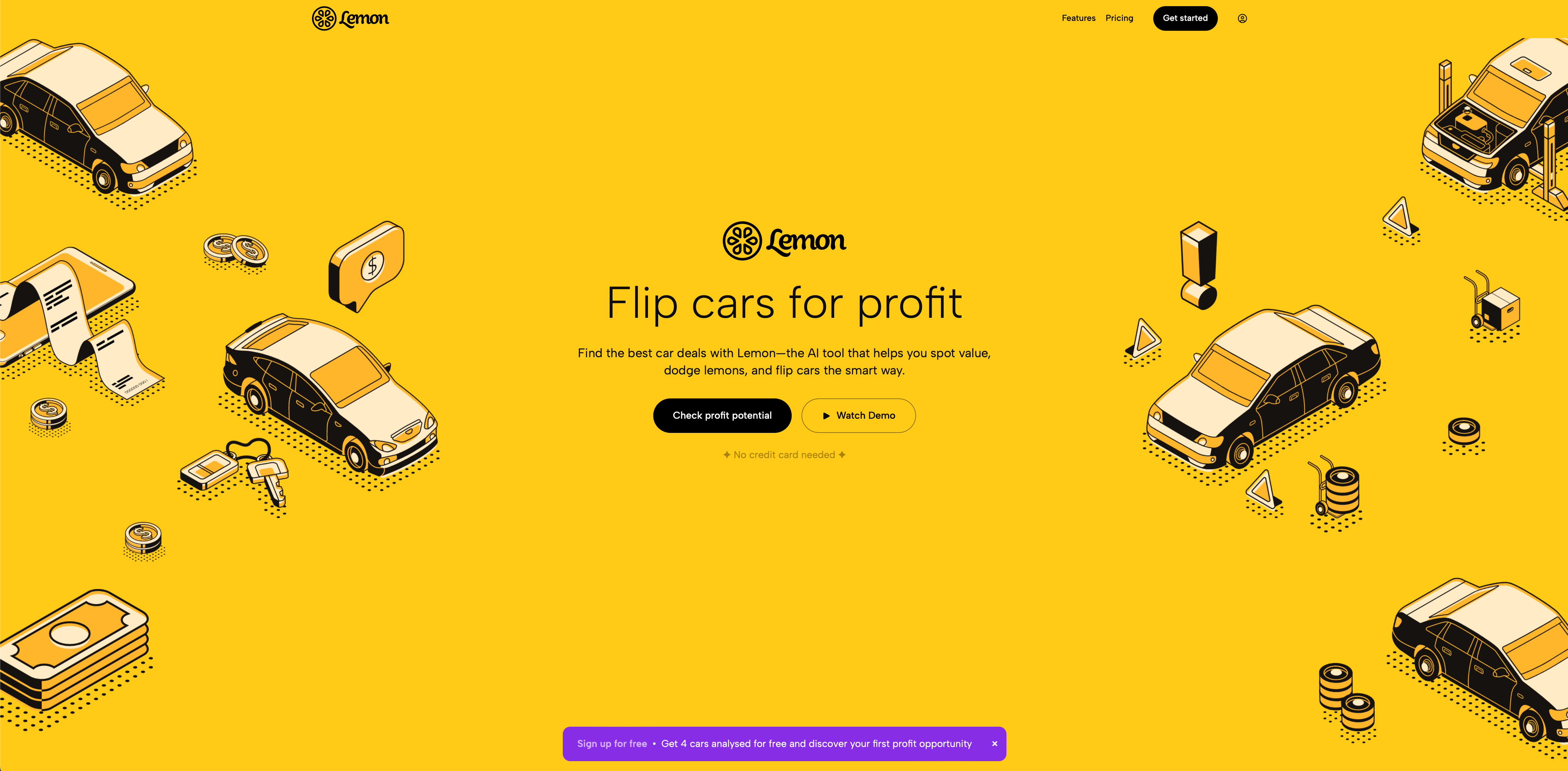
The brief was to transform complex market data into something anyone could understand at a glance. Lemon’s brand language took inspiration from bold signage and roadside iconography — distilled into a clean, geometric system. The design system was built around contrast: black, yellow, and white create instant recognition, while 3D-style vector illustrations add warmth and approachability.
The interface follows a simple principle — make profitability feel accessible. The result is a frictionless design system that invites curiosity and rewards exploration.


